Project Overview
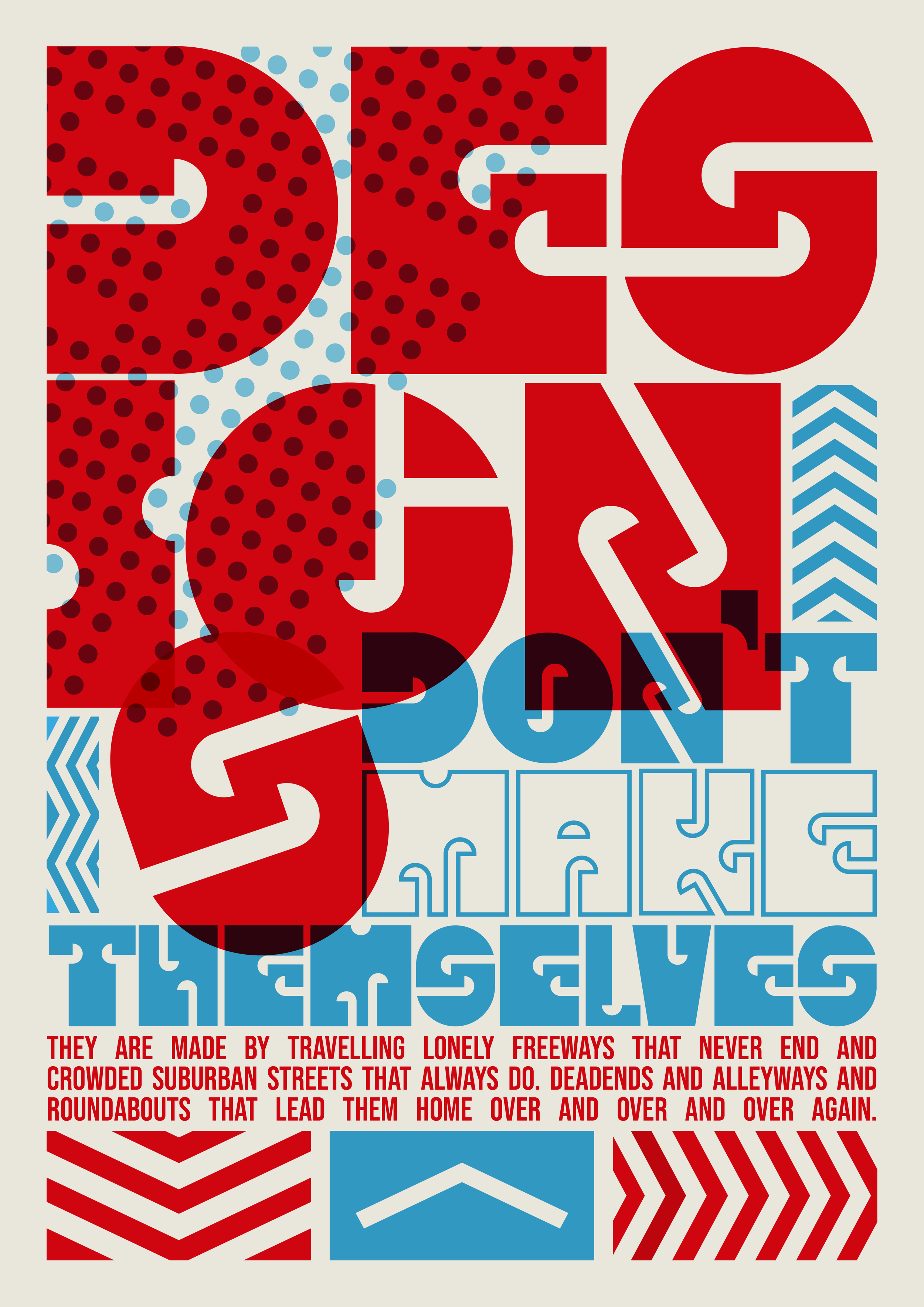
Culdesac is a modular typeface inspired by the concept of closed passageways; both literally, in terms of navigation, and metaphorically, as a reflection of the creative possibilities derived from constraint.
Constructed from a refined set of geometric components and applied to a grid system, the typeface uses repetition, rotation, and scale to form a bold, cohesive set of alphabetic glyphs.
Concept & Ideation
The project began with a broad visual brainstorming process, exploring words and ideas across five categories: political, social, environmental, artistic, and domestic. These abstract themes were translated into sketched forms on gridded paper, eventually leading to a refined visual direction focused on the spatial language of cul-de-sacs—structures that signify redirection, pause, and boundary.
Development
Building on ideas developed from my sketches, I began digitally experimenting with modular elements derived from one of the strongest early concepts.
Using principles such as rotation, repetition, and negative space, I tested multiple combinations and iterations of each letterform. The goal was to strike a balance between consistency, visual rhythm, and legibility within the constraints of the modular system.
This exploration led to the identification of five core geometric modules, which served as the foundation for the entire typeface.
Experimenting with the modular elements in a grid system in Illustrator.
Outcome & Applications
Culdesac functions as a display typeface, ideal for posters, signage, branding, or editorial layouts. Its structured, geometric aesthetic makes it particularly effective in design contexts that benefit from clarity, visual rhythm, or conceptual depth.